
 It has been discussed how logo colours can have a deep-seated impact on our emotions. In the current article, we will take a look at how colours and shapes influence our visions about logos and brands.
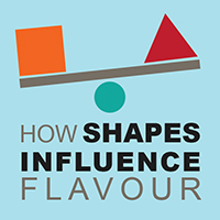
Were you aware that different shapes and colours influence the manner in which we experience a particular flavour even before we get to taste it? The appeal of the vision is stronger than anything else. The influence of vision happens subconsciously.
What does it do to us? It invariably makes us prefer one brand to another, without having any clue about the specifications of the chosen brand.
In the food industry, branding and marketing strategies are mapped out on the basis of consumerism. Food and beverage companies play upon the appeal of the vision and incorporate visual elements in their strategies to their utmost advantage. They trick us into believing that one brand is better from another and they have been making running a highly profitable venture by doing this.
Having said that, are we aware how this influence works? Let us take a look!
Consumer likes and dislikes are based on a variety of tastes (whether the food is sweet, sour or bitter), the feel on the tongue, the plethora of flavours and the number of abstract shapes available.
There are a number of examples that can be cited in favour of this statement.
We are all aware of how rounded forms of food are associated with a sweet flavour. A ball of ice-cream would be certainly preferred by a child who understands rounder forms to mean sweeter tastes. Similarly, angular shapes like a triangle or a star would be associated with tangier or bitter tastes and also with carbonated food and beverages.
Meeting consumer expectations is prioritized in the food industry. Manufacturers are aware that using the right shapes on packaging and presentation would boost sales volumes and lead to profits. They use shapes, designs, colours and words to play upon the taste buds of the consumer. By tending to the sensorial expectations of the customer, they are only making more profits.
While passing through the busy aisles of a supermarket, people tend to notice the colours and shape of a logo and the outer packaging of a product. This is what decides the final purchase.
This impact works with colours as well.
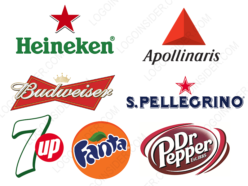
Red being associated with sweetness is used on the label of the most popular cola drink manufacturer of the world. Similarly, the logo of 7 UP contains a significant red circle in the middle that further emphasizes the sweet flavour of the drink. Moreover, the green colour of the entire packaging is used to accentuate the flavour of limes/lemons in the drink.
For a quick summation, it can be stated that colours are here being used as compasses to tastes. We are being directed towards our preferences and subconsciously so.
On similar lines, a large number of beverage companies make use of angular red shapes like a red triangle or a pyramid to lure the customer’s attention to the carbonated contents of a bottle.
Have you noticed that Heineken and Pellegrino’s sparkling mineral water bottles have red stars on their packaging? What meets the eye stays in the mind for a longer time. Pellegrino has time and again proved this statement with the aid of a highly successful product packaging design. For more than a century, they have been marketing their products very well.
Although, they are not the only company resorting to angular shapes for their profits. There are several other companies that take the help of colours and shapes to make their products work.
Brands run on popularity and that comes from how they carry their charm from the eyes to the brain of a human being. If you are attempting to venture into manufacturing food or beverages, it would be beneficial to know how consumer psychology is studied and made a foundation for companies to thrive.
From colour co-ordination to designing the outer shape, everything is done to make the whole package visible to the human eye. There is a proven link between shapes, colours and tastes and over the years, the understanding of and the evidence for such correspondences have grown exponentially.

